Wardrobe Suggestions
These are YOUR photos, you choose to wear whatever you like! However, I do recommend wearing certain tones to ensure you get that beautiful, creamy tone that you see in my galleries and social media posts.
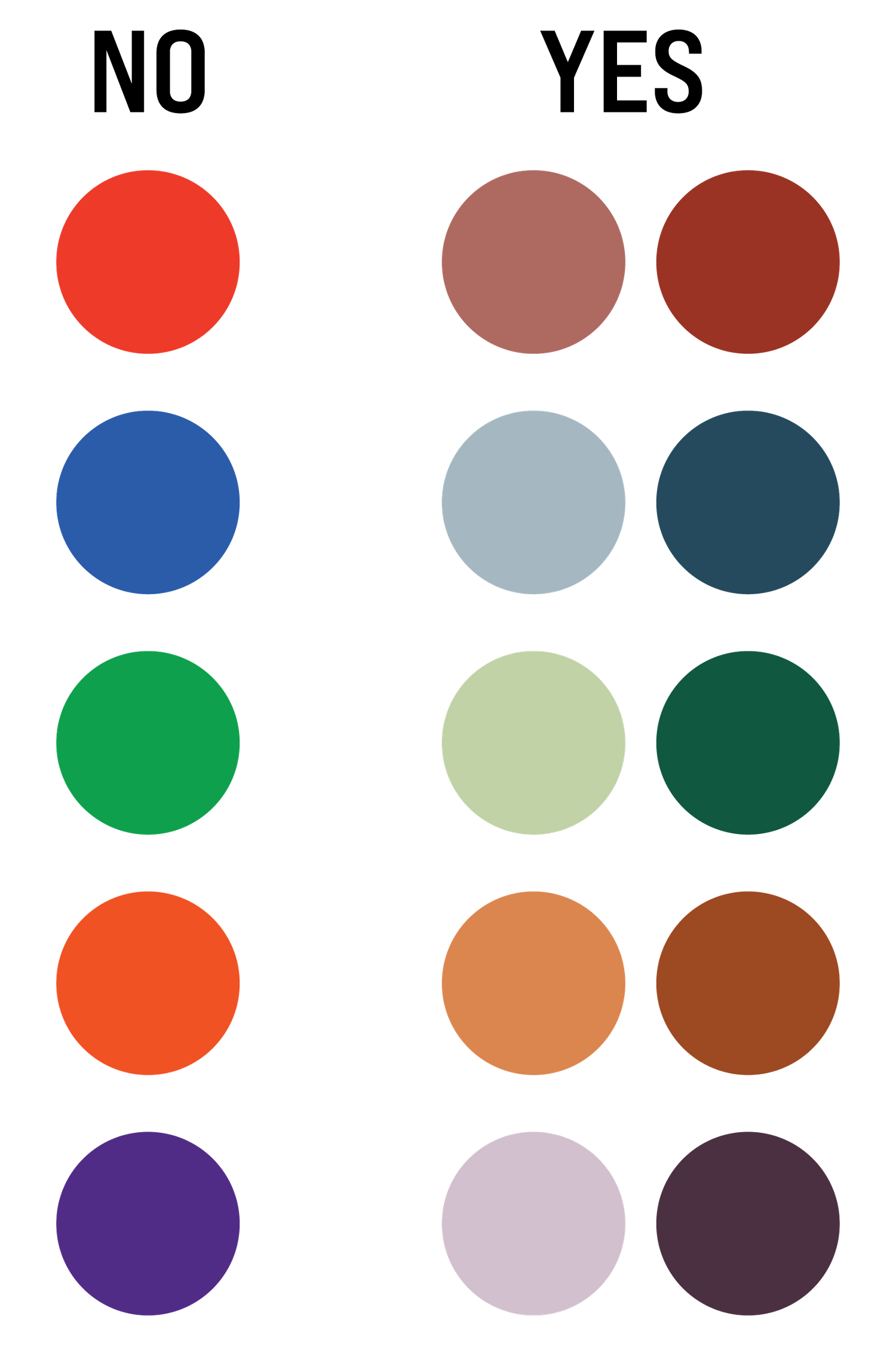
Neutrals always look the best in photos (grays, browns, tans, white, black). Wearing neutrals guarantees that you will coordinate with your background perfectly and makes the end result so cohesive! If you're not a fan of neutrals or want to add some color (I love color!), try muted or deep tones (think lavender and blush, or navy and maroon).
***Try to avoid bright, loud tones such as fire engine red, kelly green, or bright blue.***
If you're scheduled for a session with other people, always try to coordinate your outfits, but don't match! For example, instead of everyone wearing navy, have some people wear gray, some navy, some white, and some maroon. This will look GORGEOUS in photos!
Check out the Color Guide at the bottom of this page to help you with your color choices.